This pattern provides a control, which allows selecting one value out of several.
Tabbed pane
User interface controls are grouped in a container with a paging mechanism.
Context
Operators need to review complex settings, which do not fit on a single screen.
Forces
The number of tabs is limited by screen real estate; there should not be more tabs than fit on the screen. Managing excess tabs is difficult and intransparent for the user; in such a case, information needs to be regrouped. Care should be taken on how categories are created; they should match the user’s mental model of the task.
Inexperienced users may not be familiar with the concept of tabs and take some time to learn paging in a container. I observed users treating tabs similar to command buttons, thinking they could perform actions with this type of control.
Safety-relevant functions and information may be covered by paging through a tabbed pane, therefore, it should not be used for safety-related functions.
Solution
Provide a tabbed pane presenting groups of user interface controls in a way such that only one group is visible at a time and the other groups are represented as linked headings. Clicking on one of the inactive headings hides the active group and brings the clicked group to the foreground.
Example

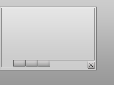
The example shows a dialog with an empty tabbed pane.
Usability Impact
Grouping information reduces screen clutter and puts emphasis on information meaningful in a given context.
Safety Impact
Reducing screen clutter allows operators to focus on important elements, however, this control should be used with care for safety-related functionality.
Show all articles