This article reviews UI patterns based on the simple command button and adds some background…
Top Selection Controls for Safety-Critical Touch Applications

Selection controls allow users to pick one or more items out of a given range.
Dropdowns
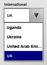
Strictly speaking, dropdowns are compound controls consisting of:
- A command button to open and close the associated list
- a list control containing the items and
- a text field or a (non-editable) text label
Initially, dropdowns only handled text entries, allowing to alter line height and adding icons later with the arrival of Windows 95 (Cooper, About Face 3.0, p449). Microsoft Office further extended dropdowns to display a preview of the selected style.
Considerations for safety-related environments
The dropdown pattern is especially useful when screen real estate is a limiting factor. In such cases, it may act as a replacement for list controls, which consume more vertical space.
However, dropdowns only display the current selection and hide the list of items. When designing with this control, no safety-critical functions should be assigned to it — safety-related functionality should always be visible.
Another limitation of is the maximum number of items it is able to hold. The list must be able to display all items without the need to scroll.
Circular Lists
Press the Up and Down buttons to scroll the list or drag the thumb.
The circular list pattern is a modification of a standard list with regards to its scrolling behaviour. When the first or the last item respectively is reached and the user tries to continue scrolling up- or downwards, the list jumps to the other end.
Considerations for safety-related environments
The list is better suited for a larger number of items than the dropdown. However, scrolling becomes tedious especially on touch screens with a large lists. Therefore, the maximum number of items should be limited to two or three times the height of the list control itself. I.e., if the list is able to display 10 items, the total number of list items should be no more than 30.
Selectors
The selector control pattern is somewhere in between a tabbed pane and a classic radio button group known from desktop applications. It can be used to select an item out of several choices, or to switch views.
Considerations for safety-related environments
When used to switch views no safety-related functionality should be hidden in these views because they may disappear from sight.
Pick Lists
The pick List pattern presented here is a compound pattern consisting of:
- command buttons to move items from one list to another
- two list controls, one acting as a source and one as a destination for selection
The pick List pattern is a typical representant for selection controls: It combines selection controls with imperative controls to actually carry out the action.
The pick list solves a shortcoming of dropdowns and lists: These patterns are only useful for single selection. Multiple selection is almost impossible in dropdowns, and not recommended for lists because the selected items can scroll out of sight, or the selection may be cleared inadvertently.
Considerations for safety-related environments
Selection controls are used in this pattern collection to increase safety. When selecting an item no action is performed — users need to confirm the action by interacting with the imperative control.
If selection controls were designed to perform commands immediately, erroneous selections could not be corrected. However, if a selection control acts as a filter or changes the view of a data set, it is acceptable to have selection controls perform actions as well.
Show all articles