In this article, I'd like to show how much more efficient designing in the browser…
Web Performance at intu.io: From Zero to 100

(Original blog post on web performance in German by Björn Ganslandt)
Video: Left hand side shows web performance of optimised intu.io loaded from a browser located in London, UK, right hand side shows the performance of the original page. In between: 4 seconds.
intu.io in its present form is almost 5 years old. In the internet, this is a very long time, and we’re almost a bit proud, that you cannot tell the age by looking at the website. However, we realised there was room for improvement concerning web performance.
However, in the meantime a lot of things happened, and since then especially demands regarding speed of web sites have increased. It was about time to overhaul our website in terms of technology and make it faster.
The first stops in such an enterprise are Google’s PageSpeed Insights, and WebPageTest. Both confirmed in our test runs that there was a lot to improve: measured from a London-based node, the page took 4.5 seconds before the browser actually started rendering, and PageSpeed Insights gave 74/100 points for mobile devices.
After our improvements browsers started rendering after 0.5 seconds, and also Google’s mobile heuristics rewarded the optimisations with 98/100 points. And this is due to only a few changes, which we will explain here in more detail.
Web Performance: Become static
The first significant improvement targets the server, because every analysis showed very clearly that the Time-To-First-Byte (TTFB), i.e., the response time of the server for the first request was much too high. WebPageTest returned a value of 3 seconds, and tests on-site in Vienna returned a TTFB of at least one second. As long we wouldn’t be able to reduce this value, all other improvements would worthless because browsers cannot do anything without data.
Because all static assets were delivered fast, and the DNS request was carried out swiftly, we had the suspicion that WordPress, or PHP respectively, delayed the delivery in spite of caching turned on. With not a lot of dynamic content on the page except our Twitter feed, and due to the fact that we enjoy building Gulp toolchains, our first step was to migrate from PHP templates to static HTML.
Although we still use PHP for preparing the Twitter feed we load it asynchronously via AJAX, and insert it into the page using JSON. Therefore, we were able to PHP from the critical path completely. With the result that the first byte from London arrived within less than 300 ms.

Figure: Comparing Time-To-First-Byte before and after optimisation
Migrating from PHP to a static site reduces the Time-To-First-Byte and the overall web performance dramatically, as you can see in the figure (above: before optimising, below: after). You can see the redirect to the English version of the site.
Providing a bi-lingual version of the site was a challenge for tooling. It didn’t make sense to maintain two versions of index.html in parallel in two languages. We were striving for a solution which would be able to provide a localised English version without additional effort. The Gulp module gulp-l10n is able to recognise strings in HTML files, and to generate a JSON file, which can be used to translate these strings into different languages:
de.json
{
  "a7bfcebb": "Das intuio Team",
  "52e7f683": "Das sagen unsere Kunden:"
}
en.json
{
  "a7bfcebb": "the intuio team",
  "52e7f683": "What our customers say:"
}
Thus, Gulp generates the english version of the website as static HTML, without having to manage and maintain a large number of keys manually. In case of new or changed strings, the Gulp build warns that the english version is no longer complete. An .htaccess redirect delivers the version of the site depending on the browser’s language setting.
Web Performance: Critical Path
Thanks to the static website, the first byte gets to the user fast — but in the old site, 1.5 more seconds elapsed until the browser started to render after the first byte. Therefore, the second step in our efforts to improve web performance, was to reduce the necessary resources in the critical path, i.e., the path to first-time rendering, as much as possible. If possible, enough information to show users something, should arrive at the browser with only one HTTP request. This path is blocked by fonts (at least in part), JavaScript, and CSS, because these resources halt rendering until they are loaded and interpreted by the browser.
Javascript
You can avoid the blockade in JavaScript fairly easily by loading all resources asynchronously. For this, the async parameter in the script tag is sufficient:
<script type="text/javascript" src="/_js/app.js" async></script>In order to not waste requests, app.js contains all JavaScripts required for the website in bundled and minified form. Because it’s the year 2016, and because modern browsers find relatively little JavaScript on our website, we decided to kick out jQuery, which saves us 80 KB (before gzipping).

Fonts
Fonts are more complex, because the do not have a built-in mechanism for asynchronous loading while providing intelligent fallbacks. This will change in the future with the font-display descriptor, but for now we have to rely on hand-knitted solutions.
If you analyse the fonts used on intu.io, you will find two groups: on one side, there are the Typekit fonts, on the other, an icon font. Typekit allows to embed its own JavaScript asynchronously, therefore these fonts load without blocking. This may lead to text changing its appearance in the loading process (FOUT – Flash Of Unstyled Text). The alternative would be to keep these blocks hidden until the font has been loaded (FOIT – Flash Of Invisible Text). Therefore, asynchronous loading is the much better option for a positive user experience.
Icon fonts have acquired a bad reputation in the past years, because they are less accessible, and are notoriously difficult to align. Thus, the decision to abandon the icon font in favour of an SVG sprite, was an easy one.
This change brings about other problems, because global CSS can only display SVGs, which are embedded in HTML. If SVG icons are expected to adjust to the text colour of their context like icon fonts do, we need icons embedded in HTML, and the magic property currentColor, which always hands down the parent element’s font colour:
.icon {
  fill: currentColor;
}
All icons receive the class .icon.
This class fills all SVG paths with the current font colour, such that the SVG icons blend in using the same colour as the text. Multi-coloured SVGs lose all their colours and require a different class.
In order not having to add SVGs to the template every time you want to use them we used the very comfortable sprite approach, which allows to reference images via their ID, and not via their relative position in the sprite.
We generated the sprite using icomoon.io.
Sprite
<svg style="position: absolute; width: 0; height: 0;" width="0" height="0" version="1.1" xmlns="http://www.w3.org/2000/svg" xmlns:xlink="http://www.w3.org/1999/xlink">
  <defs>
    <symbol id="icon-pencil" viewbox="0 0 24 28">
      <title>pencil</title>
      <path d="M5.672 24l1.422-1.422-3.672-3.672-1.422 1.422v1.672h2v2h1.672zM13.844 9.5q0-0.344-0.344-0.344-0.156 0-0.266 0.109l-8.469 8.469q-0.109 0.109-0.109 0.266 0 0.344 0.344 0.344 0.156 0 0.266-0.109l8.469-8.469q0.109-0.109 0.109-0.266zM13 6.5l6.5 6.5-13 13h-6.5v-6.5zM23.672 8q0 0.828-0.578 1.406l-2.594 2.594-6.5-6.5 2.594-2.578q0.562-0.594 1.406-0.594 0.828 0 1.422 0.594l3.672 3.656q0.578 0.609 0.578 1.422z"></path>
    </symbol>
  </defs>
</svg>
Icon
<svg class="icon">
  <use xlink:href="#icon-pencil" />
</svg>
As a disadvantage of this technique, these inline sprites become part of the critical path, even if intu.io uses them relatively far down on the page. Considering that these icons use only a few kilobytes, this is well acceptable. In addition, you can see that the icons in the sprite have a title tag, which holds machine readable information about the content of the image. For screen readers, this icon is not invisible anymore.
CSS
Although it’s possible to remove JavaScript and fonts on intu.io from the critical path completely, CSS is still required to display well structured content to the user — at least a little. We decided to split CSS in critical and uncritical parts, and to deliver critical CSS immediately while loading the rest after the first render.
For this purpose, there are a number of tools, which are able to extract critical CSS based on a predefined fold (the lower limit of the browser viewport). Considered critical is everything required for rendering above the fold.
We decided not to use these tools in the redesign of intu.io because the easy handling comes at a price and causes a lot of problems: Usually, they start a headless browser like PhantomJS and analyse, which CSS is effectively above the fold. This restricts analysis to only one browser; Firefox and IE might need slightly different CSS. The tools we looked at for this purpose force the user to reload the extracted critical CSS later a second time in the process of loading the complete web page. This has the advantage that the sequence of all CSS rules remains the same, which eliminates CSS bugs caused by changed style priorities. But it also means that a considerable part of CSS has to be downloaded twice.
Because SASS modules generate our CSS, we decided to follow a manual approach, which means more work, but at the same time more control and less redundancies. The basic approach remains the same: in the file critical.css we merge all modules needed for the part of the website above the fold, and enough CSS for the area below the fold to approximate its final state. Gulp packs everything else in a second file, which is applied only after first rendering. For this, we use the preload method from loadCSS:
<link rel="stylesheet" href="dist/_css/critical.css" type="text/css" media="screen" inline>
<link rel="preload" href="/_css/base.css" as="style" onload="this.rel='stylesheet'">
<noscript><link rel="stylesheet" href="/_css/base.css"></noscript>
If the browser supports preload, it loads the non-critical base.css in a non-blocking fashion, and declares it as a style sheet only after the OnLoad-Event. The blocking analysis of the style sheet happens after the user already sees the critical area. Browser not supporting preload receive a polyfill as a part of the bundled JavaScript and loadCSS to achieve the same functionality. Browser without JavaScript load CSS via the NoScript-Tag.
The code sample includes another performance improvement: if critical.css is loaded as an external resource, a new HTTP request will be generated, which is still is known to be quite expensive in HTTP1.1. For this reason, a part of the gulp tool chain, Gulp-Inline-Source, processes HTML code and integrates all scripts, CSS, and images containing the parameter inline into the HTML template. On intu.io, this applies in addition to the critical CSS also to the SVG logo. Like this, we merge everything needed for decent rendering of the page in just one HTTP request, and the browser is able to start rendering after less than 500 ms.
Modernizr
With Modernizr, we encountered an unexpected obstacle in implementing critical CSS. We use a lot of animation on intu.io to smoothen the experience during page buildup. This animation code initially depended from the class .cssanimations to guarantee its usage on browsers, which actually support CSS animations. Modernizr sets this class on the HTML tag, as soon the browser has been tested for its animation capabilities. For the critical path to rendering this means that the page buildup animates only after loading and executing JavaScript. Thus, the critical path needs to wait for uncritical resources, and takes a unnecessary detour. The solution was simple: start animations without Modernizr and without the class .cssanimations — browsers, which don’t support animations thankfully have the decency of ignoring it.
Web Performance: Images
A short critical path will display the website quickly to the users, but in real life the rendering process has not finished due to uncritical resources, which need to be downloaded. Looking at this uncritical data you will realise that, for a large part, they consist of images (before and after optimising). To speed intu.io up, it was important to reduce the downloaded image bytes as much as possible.

Figure: Comparing the number of requests with size of different asset types
Which resolution is best for an image varies depending on size and pixel density of the device. For optimal web performance, you will need responsive images. Depending on the position we implemented images using CSS media queries (for backgrounds), or using the picture tag. The picture tag has a specific property: we wanted some images not to load at all for small breakpoints. display:none via CSS does not really solve the problem, because the browser starts loading images before analysing the CSS. For this reason, we implemented a 1x1px GIF coded in base64:
<picture class="hidden-phone">
  <source media="(min-width: 37.5em)" srcset="/_images/01_home/chair.svg" type="image/svg+xml" />
  <img class="tagline__img" src="data:image/gif;base64,R0lGODlhAQABAAAAACH5BAEKAAEALAAAAAABAAEAAAICTAEAOw==" alt="So intuitiv benutzbar und komfortabel wie Ihr Lieblingssessel.">
</picture>
For breakpoints lesser than 37.5ems the browser will load no image at all, but only show a transparent pixel, and lets us indulge ourselves in memories of the 1990s and the spacer.gif. Despite the image only being 1 pixel high, Chrome inflates the picture tag to standard line height of 18px. In addition, the class .hidden-phone also hides the image for small breakpoints, in order not to shift the layout.
The example also shows that we are using SVGs in many places because they lead to perfect results and are independent of the device’s pixel density, and usually (not always) are much smaller as the corresponding raster image. This is at least true, if you optimise them with svgo.
Web Performance: Getting rid of legacy
As with all optimisations also web performance is affected by the law of diminishing marginal utility. We were able to save almost 50% with CSS optimisation, but the difference measured in kB is relatively small, and therefore has little effect on web performance. Despite of this, we do not want to withhold our optimisations.
The first issue are vendor prefixes. We use the SASS library Compass to generate them. On the old version of our site, they have been in the same status as 5 years before, when still a lot more prefixes existed. This was before the idea of the feature flag took hold in more recent browser developments. In order to generate the only prefixes really needed, we delegated this Compass task to PostCSS, and to the Autoprefixer. This CSS processor knows the current status of caniuse.com and produces only vendor prefixes currently needed.
In our case this affects prefixes for the most recent browsers of the two big manufacterers. This also has the advantage that SASS begins to look more like plain CSS. In our opinion, future-safe development means to adapt new code using rather Polyfills or transpilers to adapt new standards, instead of developing completely browser-independent solutions, same holds true for JavaScript. In the medium term, we have to replace our beloved SASS variables with CSS Custom Properties.
Another unnecessary legacy were various workarounds needed for IE8, for which we generated a fallback in pixels for every dimension stated in rem, plus special .no-mq classes, which generated desktop breakpoints for IE 6 to 8. Because IE8 does not appear in our user statistics anymore, we decided to abandon these fallbacks completely.
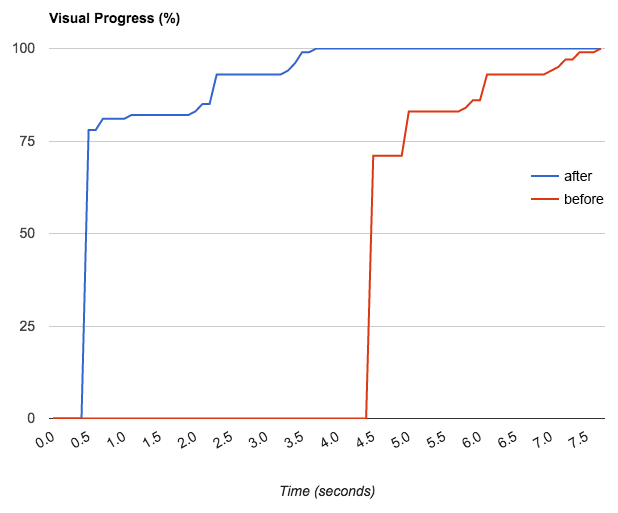 Visual buildup (red: before, blue: after). The buildup is delayed by the use of animations. But in the end we optimise for user experience, and not for seconds.
Web Performance: PageSpeed 100
A final word to the PageSpeed Insights, which showed us the major web performance deficits of intu.io before the optimisation. Different to WebPageTest, PageSpeed does not measure real performance data, but searches heuristically for certain characteristics. During the optimisation we realised that these heuristics are not always up to date, especially the desktop version of the test. In contrary to the mobile version, the test still claims that blocking CSS is loaded. Probably due to the fact that the preload trick of loadCSS is relatively new. Even when PageSpeed is a good starting point, for every optimisation there’s no way past hard data and WebPageTest. This tools also reduces its analyses to one number, the so called speed index, which tells us how fast a page reaches its visual completion. For intu.io, this number dropped from 5000 to 911 — a result we are quite happy with.
As last two steps, we decided to move to HTTPS/2, which did not result in measurable performance gains, but has rather some impact on SEO with Google ranking the secure protocol higher.
The last thing that kept our PageSpeed from jumping to 100, was the expiry time of the font files hosted at TypeKit. Thankfully, they introduced a setting, which prevents the font files to expire as described in their blog article.
Show all articles