This pattern provides the user with a possibility to enter characters.
Text Entry and Forms: Do’s and Dont’s

Much has been said about the design and behaviour of forms, and pretty much of what is true on the web and on the desktop still holds true for touch screen applications used in safety-critical environments.
This week’s post rounds up the last series of HCI patterns dealing with form usability. Here are two useful resources on the web discussing form usability in general:
- Sensible Forms: A Forms Usability Checklist by Brian Crescimanno on A List Apart
- Best Practices in Form Design by Luke Wroblewski on his blog
Text Fields and Text Editing
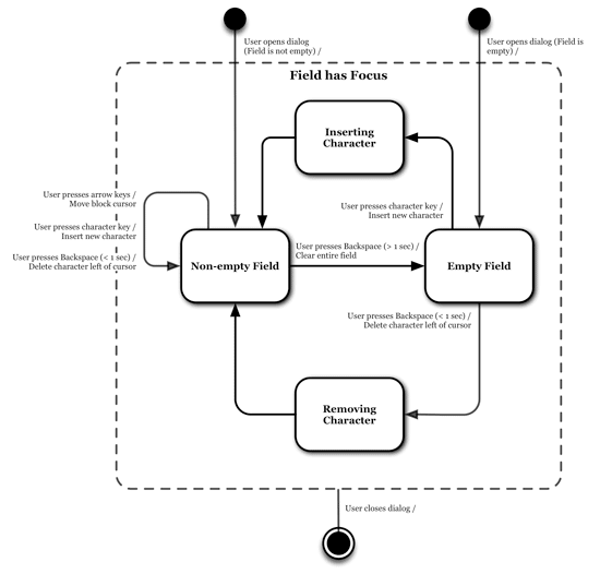
Because text entry is tedious on on screen keyboards it should be limited to a minimum when used in safety-related contexts. This is especially true for transient tasks. Furthermore, text entries which force the user to turn away from the main task are likely to disrupt the user’s workflow and may impose a safety risk.
Input Validation
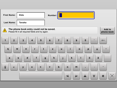
Whenever input needs to be validated it is important not to require extra steps and not to disrupt the user’s workflow. This pattern presents a common approach to this problem where invalid fields are highlighted and a general message is displayed.
Mandatory Fields

Related to the topic of input validation, the primary question should be how to avoid invalid entries beforehand. One way to achieve this is to require users to enter data in selected fields. Visual hints are added to such fields so users can recognise immediately they need to fill in data.
Form Fill Progress Indicators

Another hint to inform users of the progress they have made filling in a form of required and optional fields is to use a form fill progress indicator, which indicates how many required fields have been filled in already and how many are missing.
Certainly there are other approaches to helping users along filling in a form; the patterns here present just a small selection.
Your opinion!
Feel free to provide your comments, reports of usage of this pattern, or feedback in general!
Show all articles